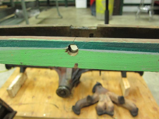
The photo at the top is the one bit of original color I found on the ’55 Morgan, on the dash support. (The original color is the lower, lighter shade.) Below are some explorations of similar colors plucked from various period British color standards, as that is probably where this color came from. Read onwards for some bad Photoshops.
(I should note none of these are going to be all that accurate. Take a look at the linked color pages for somewhat slightly more accurate colors. And I couldn’t find anything which really matched exactly.)
First up, let’s look at Linden Green.

I like this shade, in the abstract…my photoshop is questionable–I suspect the shade in question isn’t quite this lurid. But maybe it is. Maybe it should be. Maybe we should all be this lurid.
Next up, Sea Green.

This color is slightly more respectable, but I’m not very respectable, so. I like the bit of yellow in these first two shades; I’m not really looking for minty fresh, though the original kinda of has that aspect to it, eh?
Dare I google what Eau De Nil translates to, in English?

This is a fine look, befitting the beautiful people of France. I think my photoshop may be a bit “greyer” than the actual color. That said, it’s not really all that punchy, and I need punching just to feel alive these days (note, this is not an invitation, I handle my own abuse….but perhaps I’ve said too much).
Finally, here’s Iceplant Green.

I think this is definitely too mint for me, it’s also very reminiscent of a period Jaguar color, maybe Pastel Green? Far too elegant for me, I think, though it’s not a bad look.
Editing this to add a mock using the “original” color as the sample:

Hm. Not sure how close that is, my photo is “pumped” a bit compared to the actual piece-o-wood, but that’s duller than it would be on steel.
None of these will have any meaning if I don’t complete the passenger fender first. I need to buy a welder. More importantly, I need money or some work…preferably the former without strings, but the latter is OK, I guess.
You should hit me up if you want me to restore your Morgan, or at least build you a new tub. I’ve been exploring the idea of hanging out a shingle doing just that, because sane life decisions aren’t really something I am good at.
Of the four colors I mocked up, I’m leaning towards the Sea Green, or something close.
I hate to say it, but the “iceplant green” is awfully nice, as well, after I dismissed it as too minty. I do think the original color is a fair amount less saturated than my photo says it is.
Hi, Great photo-shopping to my mind. Of the 4 I think the Iceplant is the nicest and the pastel shade suits the delicate, to my eye, look of the car. But, then I like the look of them all except Linden… perhaps. Does that help at all? Regards, Simon.
I like the Ice Plant! But, I think that the original (if you were ever able to match it) is more fitting the spritely, mischievous nature of the car…
This has got to be the worst part of the job – picking color from the gazillions of options knowing what a PITA it is to change it if you aren’t happy with the result… no pressure, right??
Wait, wait… I just turned the light on in my office. Eau De Nil would look absolutely stunning on the beach west of Coupeville in March – brighten the place right up… Would also make the tongues wag enough to create a breeze in Vancouver under those trees in May…